SUMMARY
Claro Wealth - Budget, save and invest to reach your goals with the UK’s first financial coaching app. Empowering you to make smart financial decisions. Helping to learn, plan, save and invest your money ethically.
YEAR
ROLE
CONTRIBUTION
PLATFORM
2021 - 2022
LEAD UX/PRODUCT DESIGNER
UX - UI - DESIGN SYSTEMS
IOS & ANDROID
Claro Wealth - Budget, save and invest to reach your goals with the UK’s first financial coaching app. Empowering you to make smart financial decisions. Helping to learn, plan, save and invest your money ethically.
YEAR
2021 - 2022
ROLE
LEAD UX/PRODUCT DESIGNER
CONTRIBUTION
UX - UI - DESIGN SYSTEMS
PLATFORM
IOS & ANDROID
PROBLEM & GOAL
GOAL
The goal is to empower users to develop a smart money mindset to reach goals, and support them with a ‘do-it-with-me’ approach, also giving savers and investors the chance to support companies they care about who are making a positive impact on the world.
PROBLEM
Investing is complicated to get involved with especially when users don't understand the jargon, how investing works & what to invest in. Claro's idea was to understand users' goals, spending habits & interests via a one-to-one call with a financial coach & offer in-app investing solutions.
Research
DISCOVERY
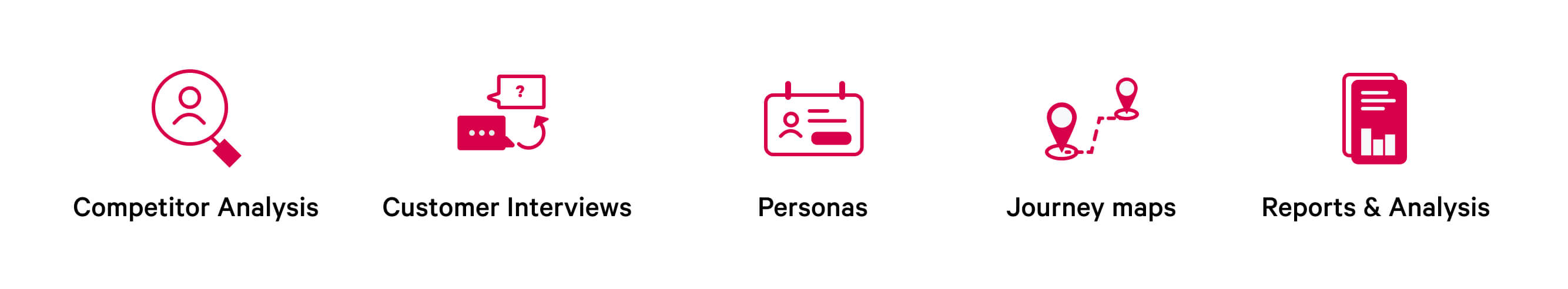
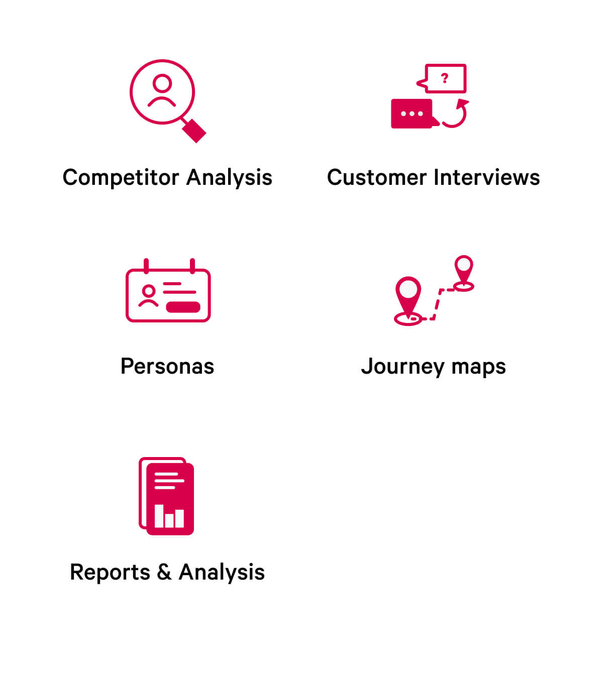
METHODS
Customer Interviews Persona Market Analysis
Quantitative Surveys User Journeys Competitive Analysis
PROCESS
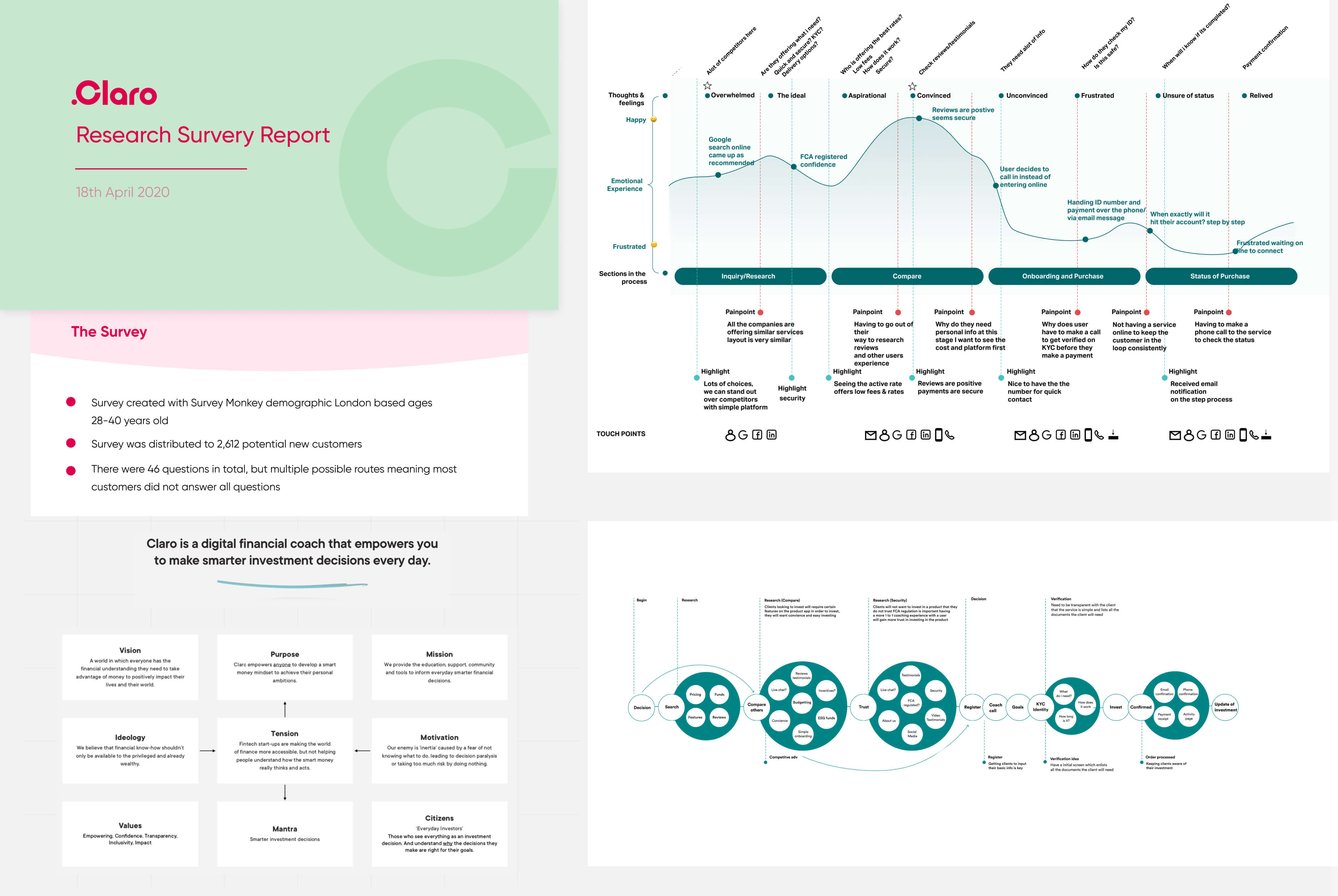
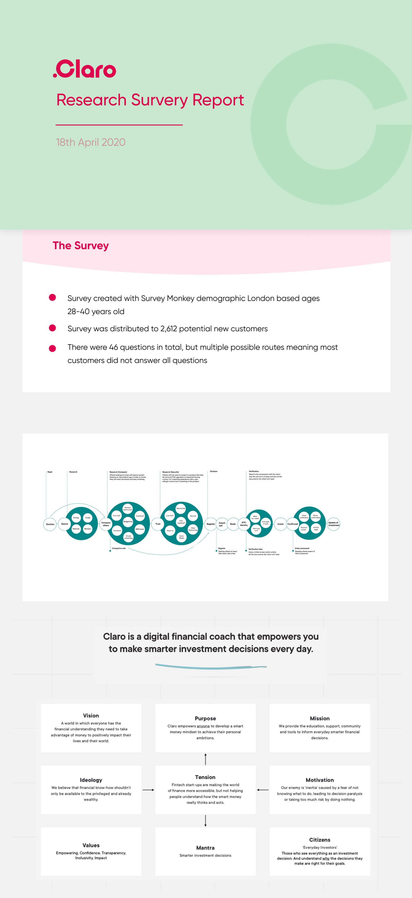
The research process was condensed to include a detailed competitive analysis which involved analysing app store/trust pilot reviews of top trending apps, understanding how the screen flows were structured. Below is the research structure involving qualitative & quantitive research. I'd done user interviews, created surveys & synthesis of findings.
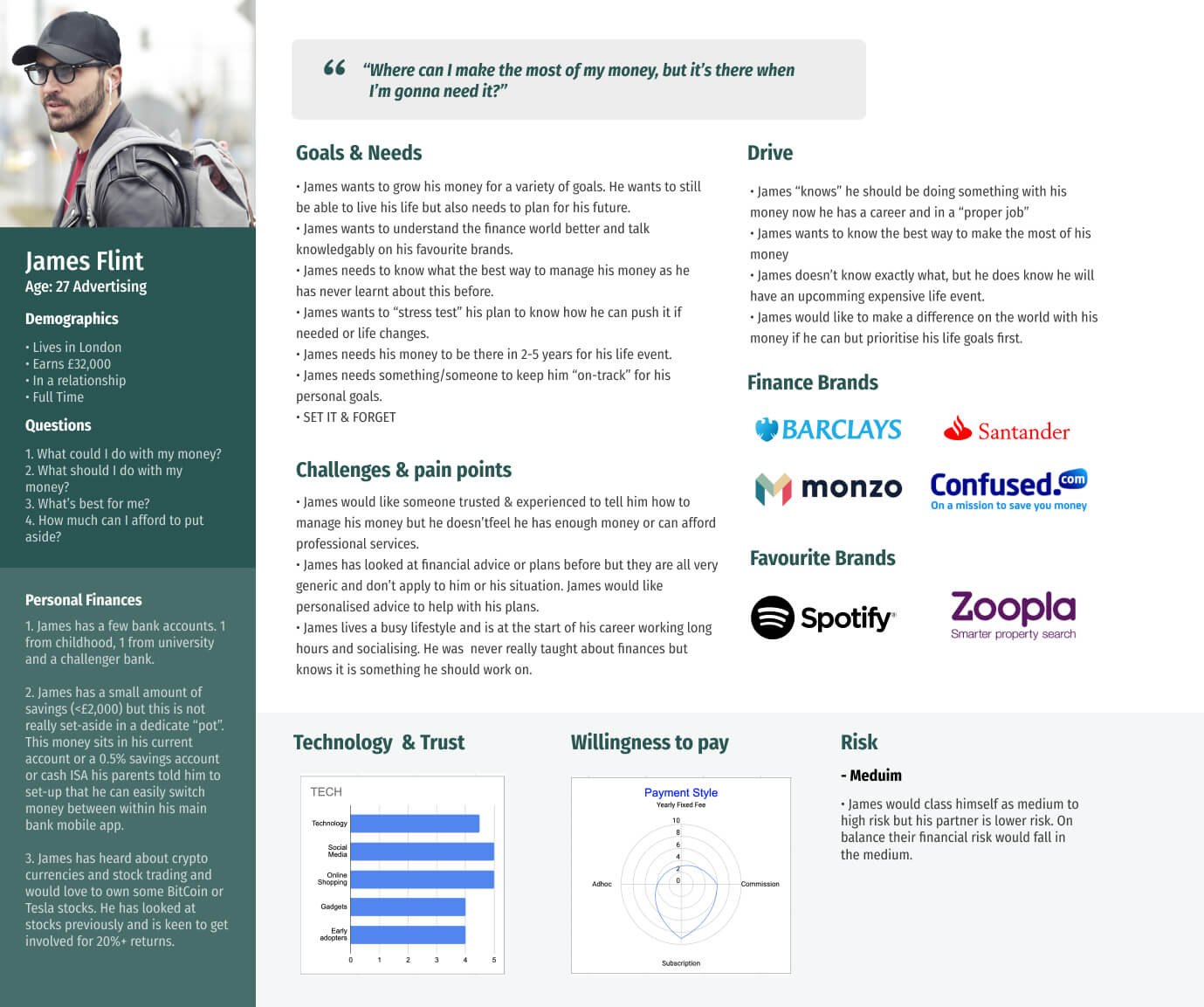
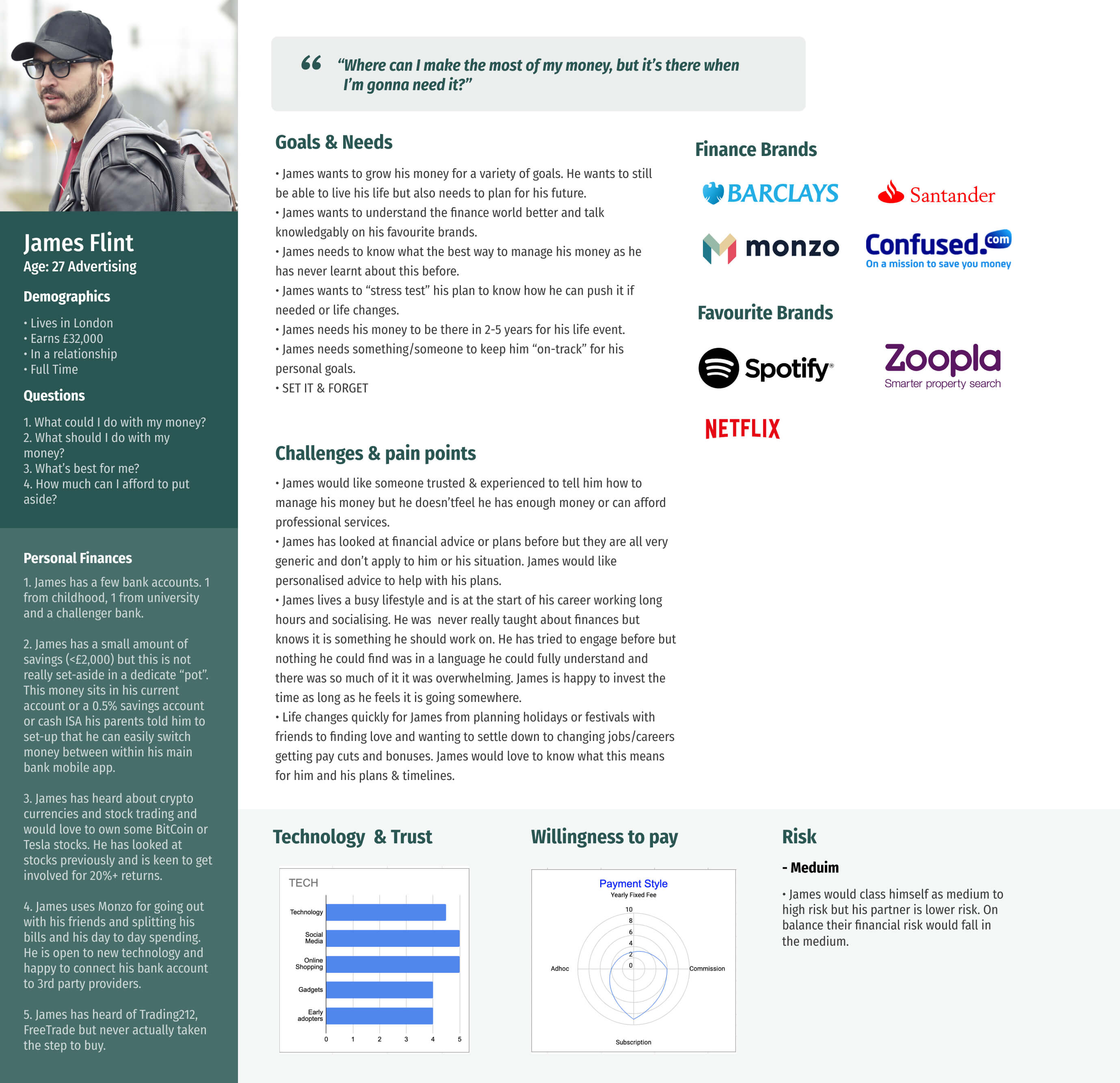
PERSONAS
From the data of user interviews and surveys, I formed sets of user personas that was to be used to relate back to while designing the solution to make sure I'm designing for actual users and their needs.
EVALUATING AND SYNTHESIZING
Visualising the journey of a user from data gathered via research helped to see the opportunities, pain points & needs users would experience in the process.
Understanding The Coaching Process
A huge part was to understand the process of booking a coaching call which meant syncing with the financial coaches to understand their process & what information they would require to give an accurate summary for a user.
Mapping It Out
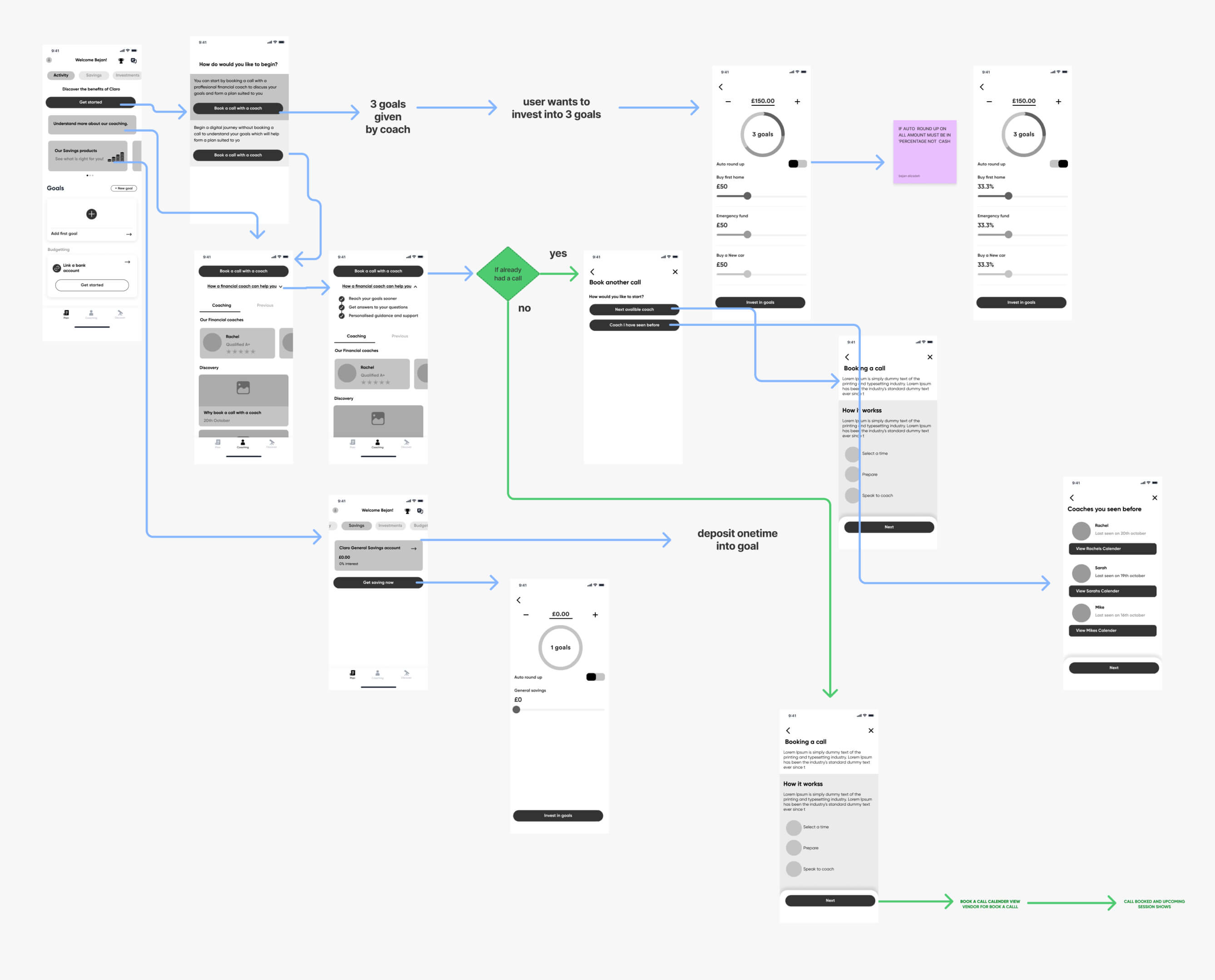
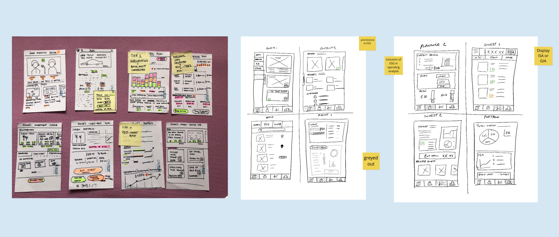
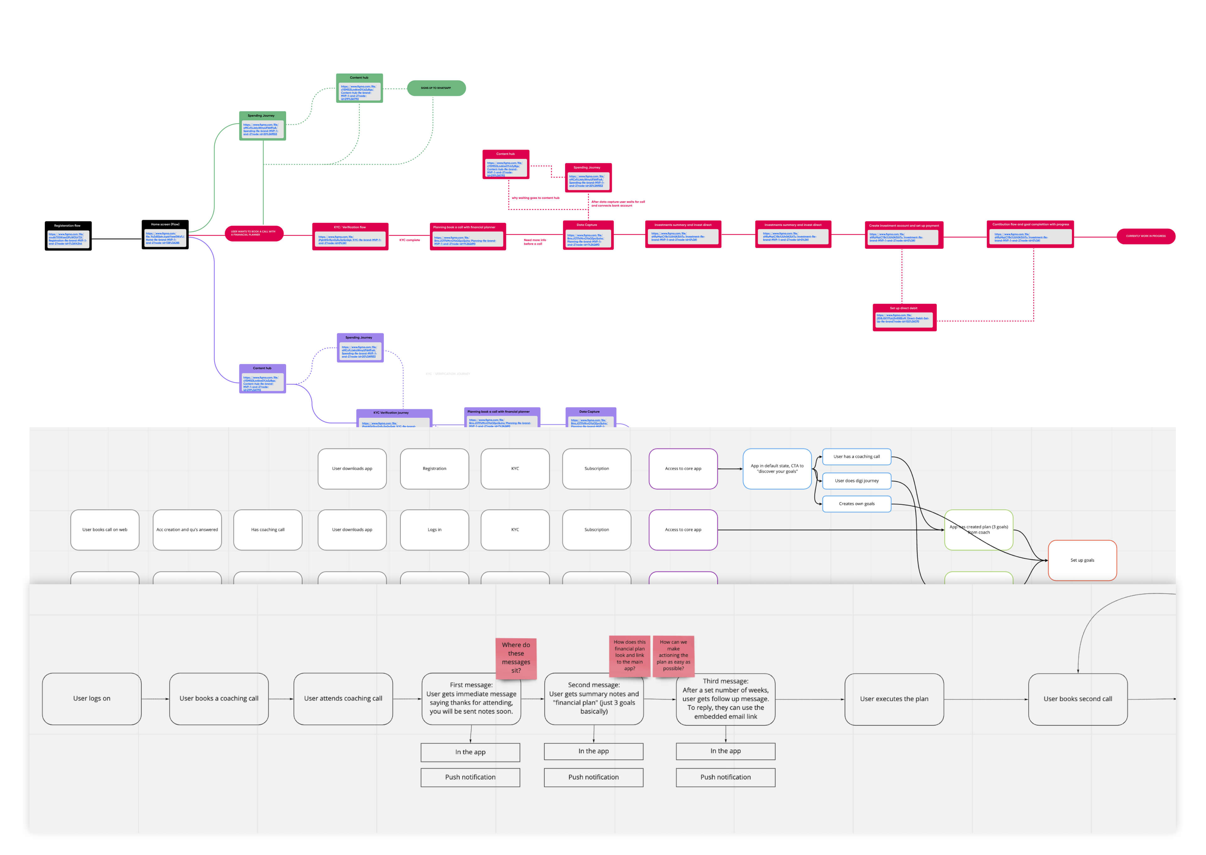
EXPLORE
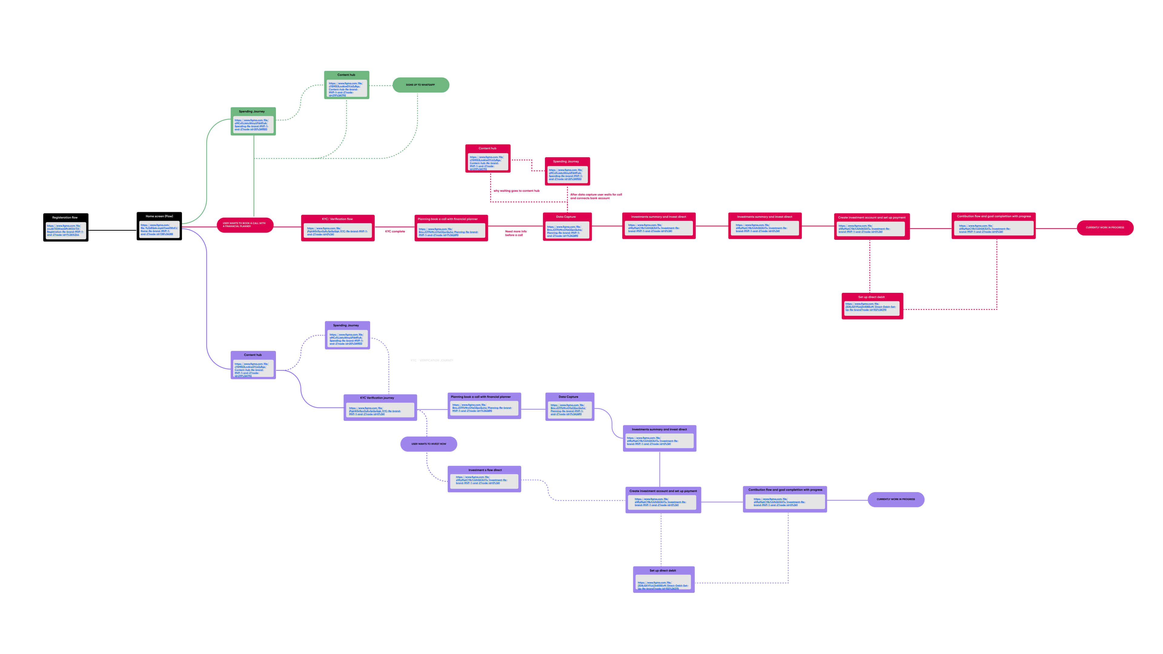
Created multiple flow diagrams for each screen flow to understand how to structure of the app. Examples of some of the flows were: onboarding, KYC, coaching, planning & spending. These flows were particularly useful for the development team to analyse before creating the visual/wireframe screen flows as they would be able to pinpoint any tech hurdles in the journey beforehand.
Wireframing
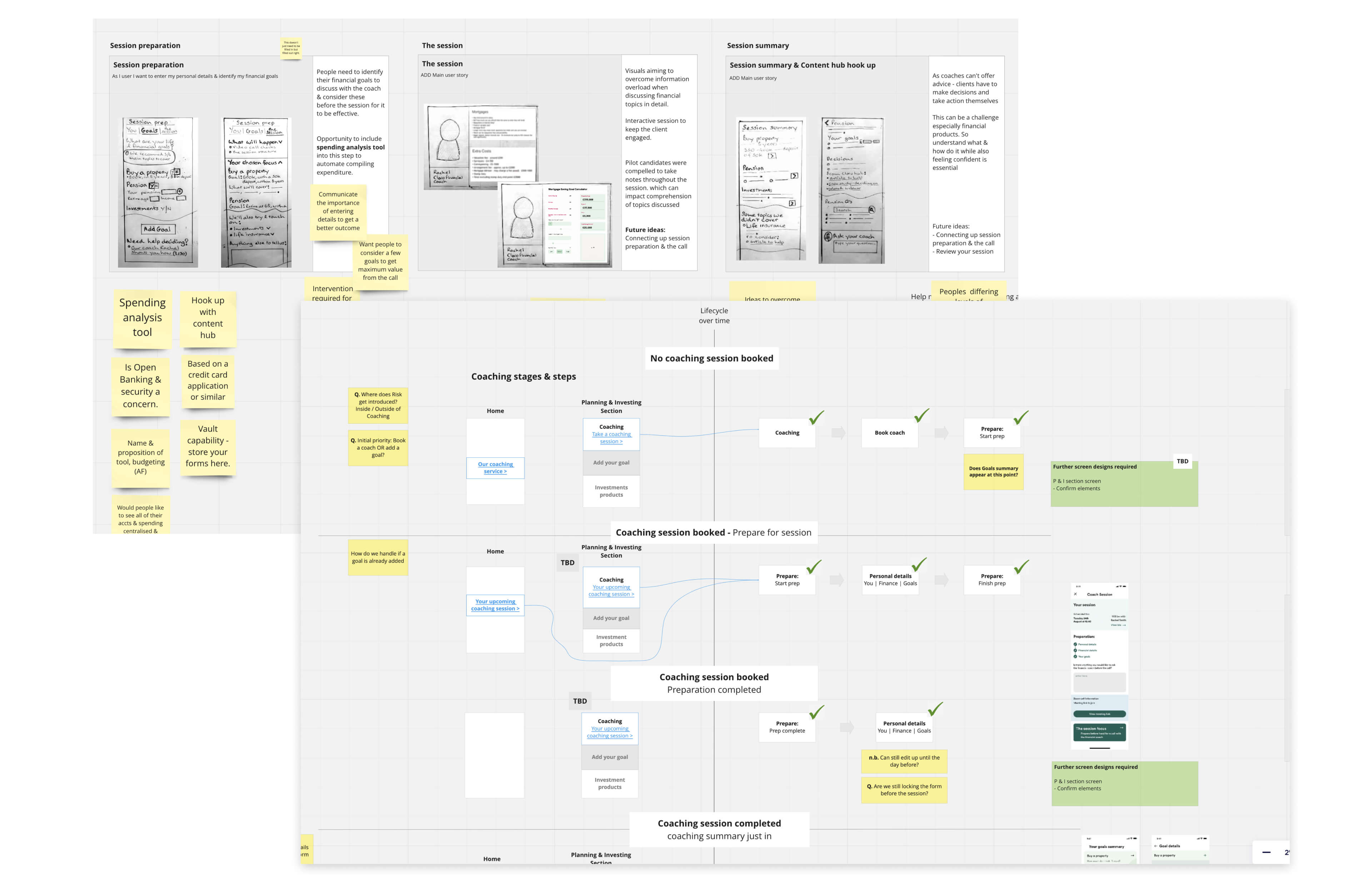
I began wireframing the individual screen flow journeys, the whole process was very collaborative with the rest of the team to make sure we are all aligned. This allowed me to test the process before hand to understand with users
Foundations and Style Guide
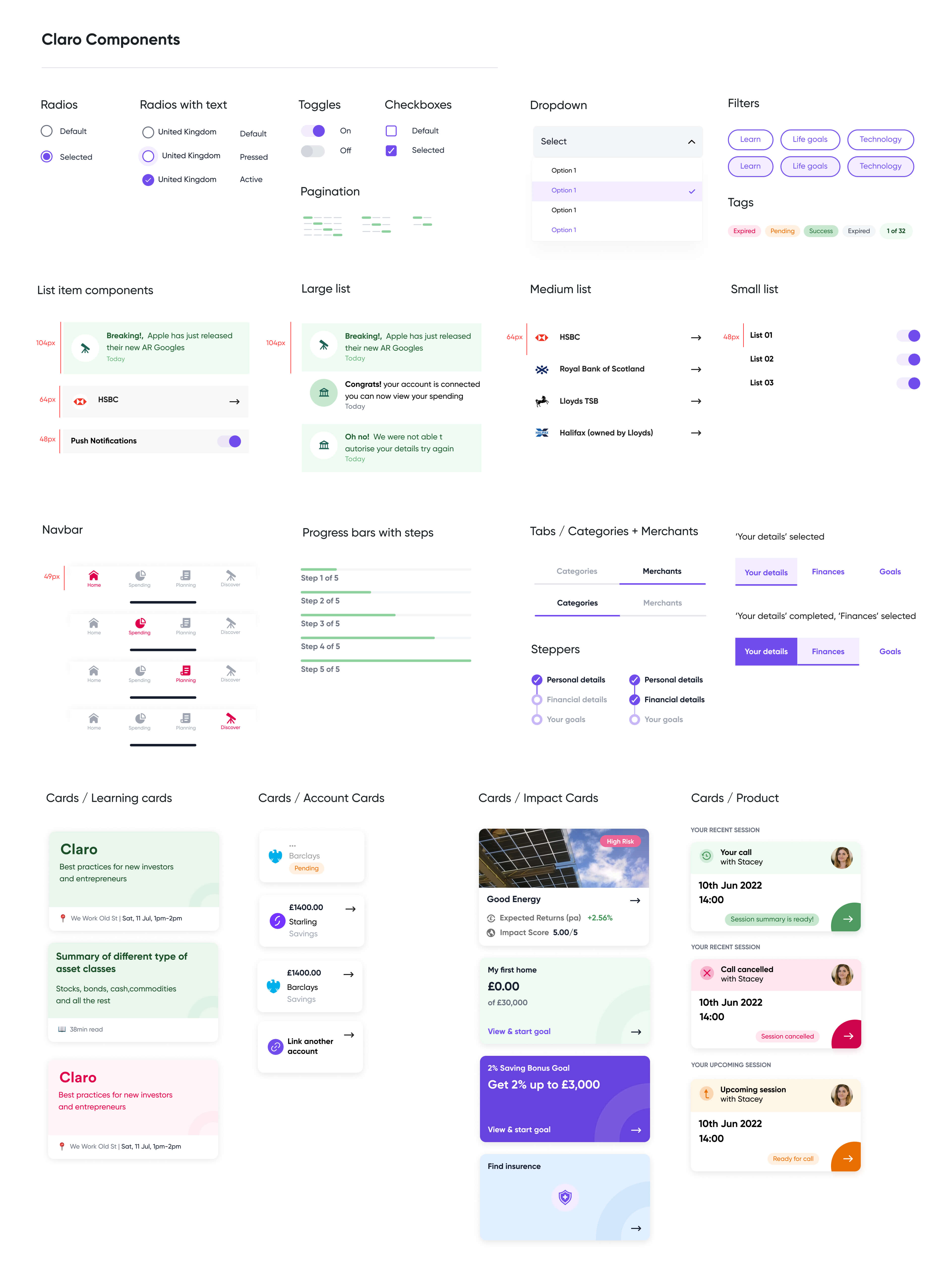
Claro commissioned an external agency to create a brand book for their brand & from that, I had to create a usable UI visual design library for Claro's app.
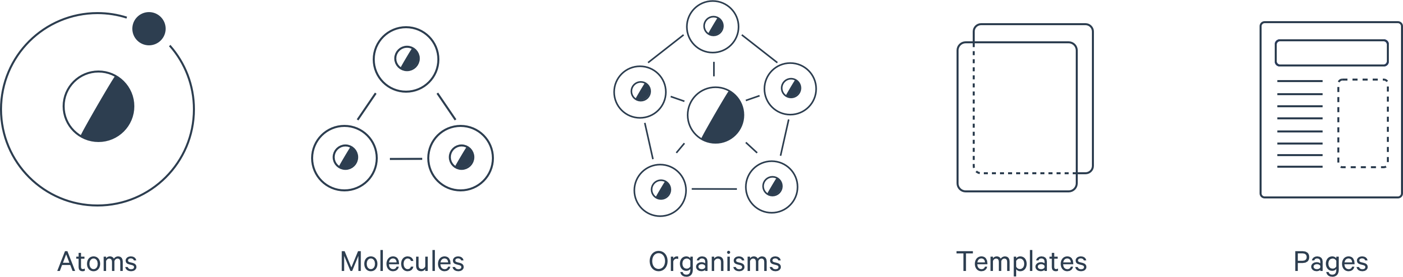
Elements were built using an 8 pt grid system concerning the 'Atomic design system method'
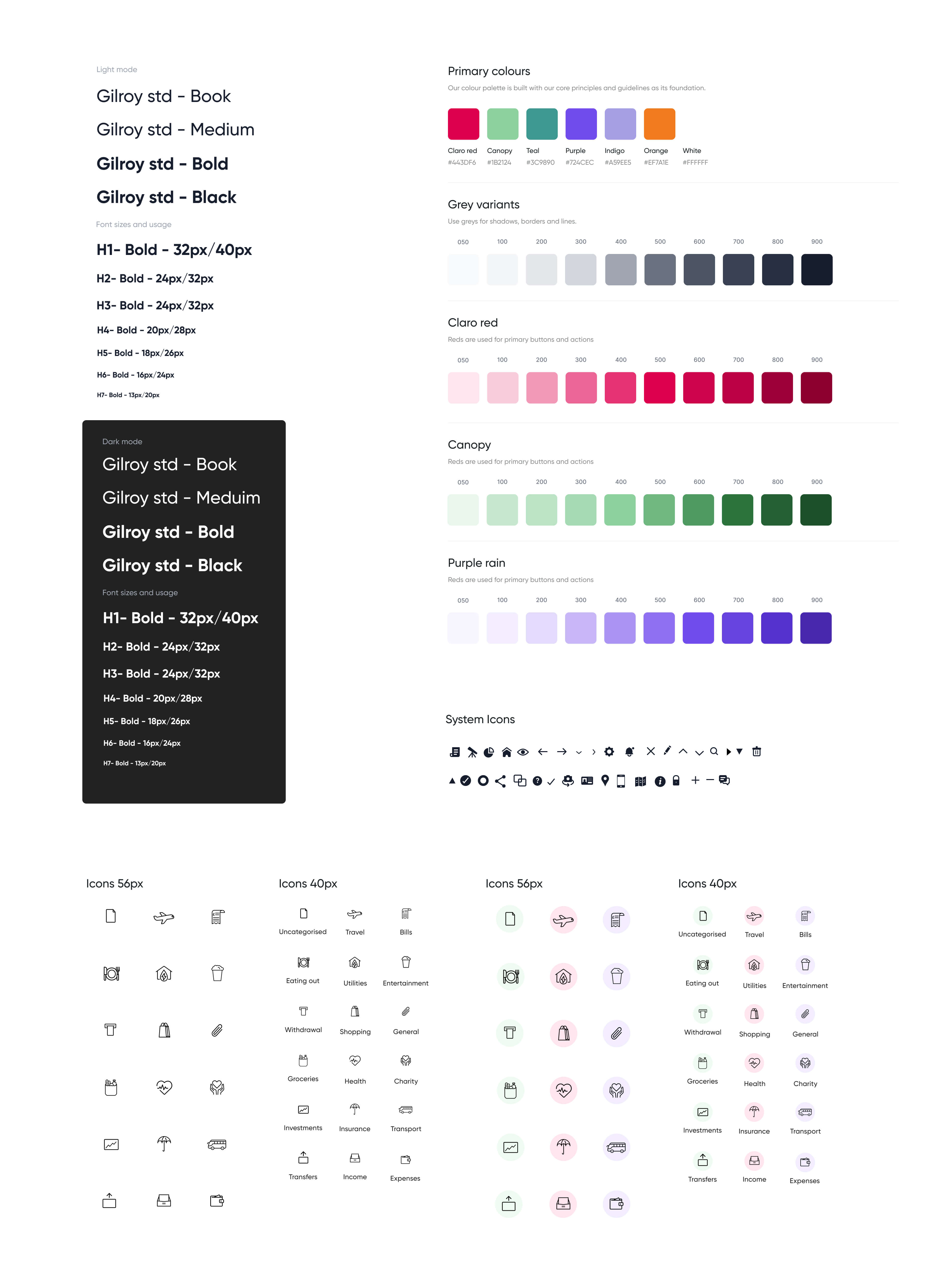
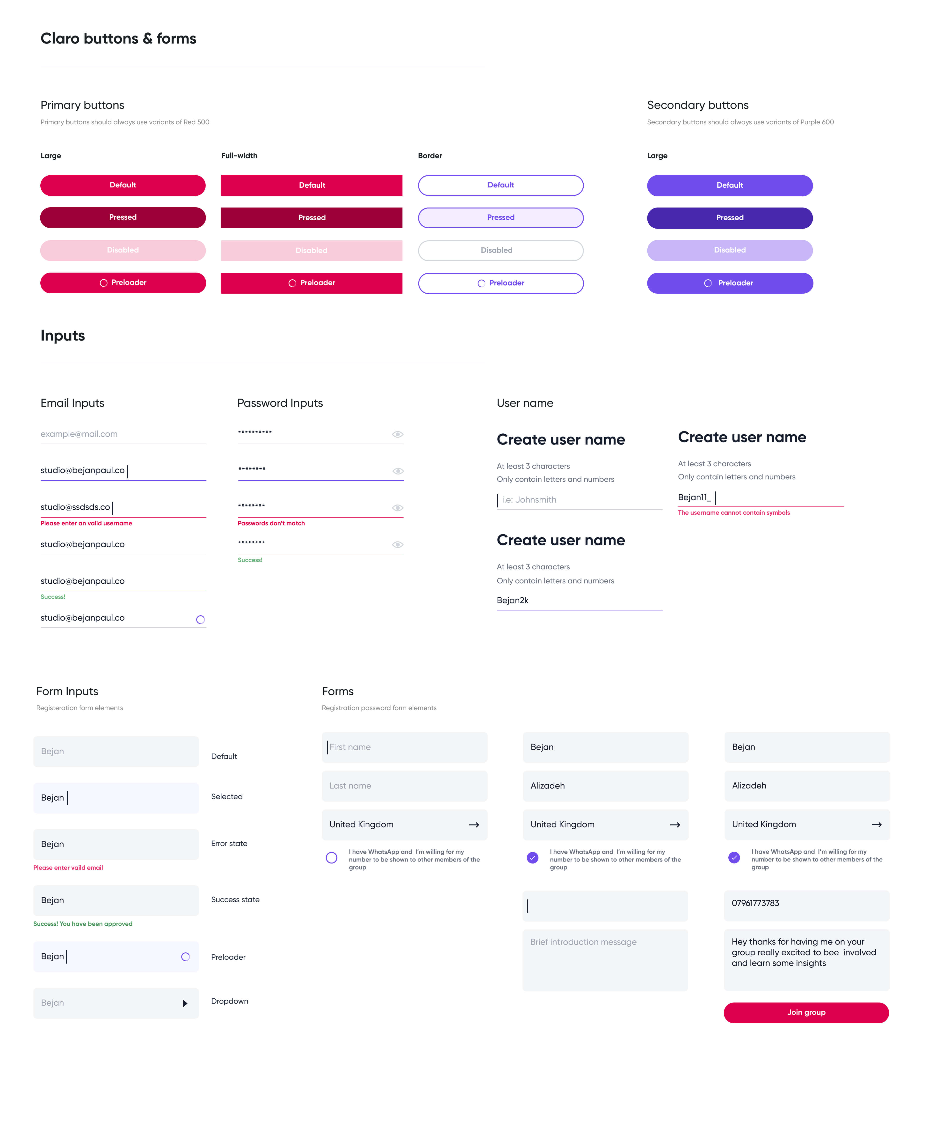
Design System
With reference to the style guide above I built out sets of reusable components that were used in all the screen flow documents for the product, this was especially useful for keeping all the elements of the product consistent. The library took into account accessibility, buttons, forms, widgets, list items, nav bars, cards, illustrations & tabs.
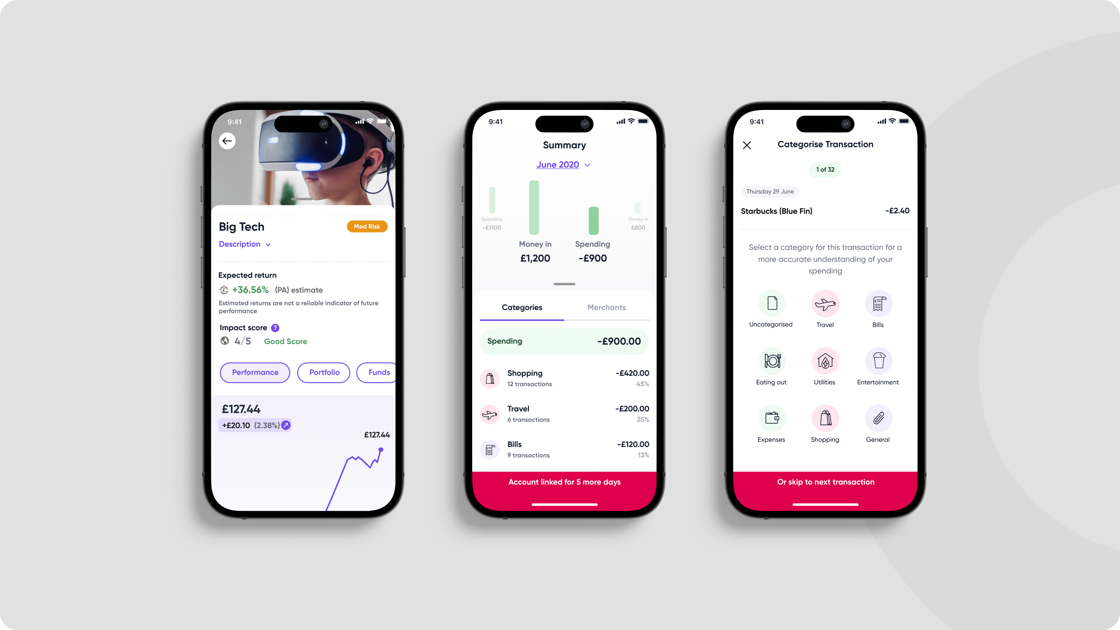
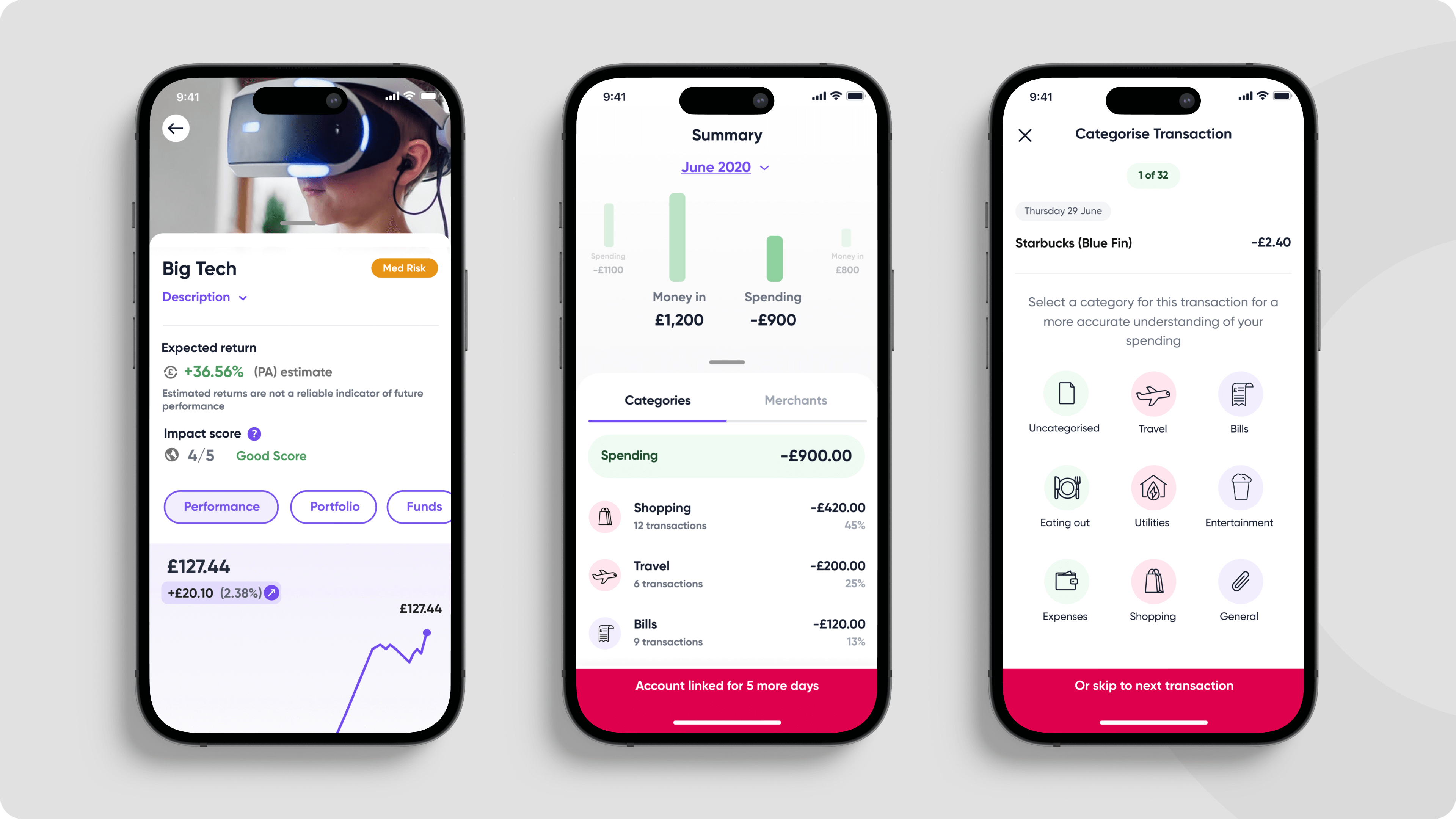
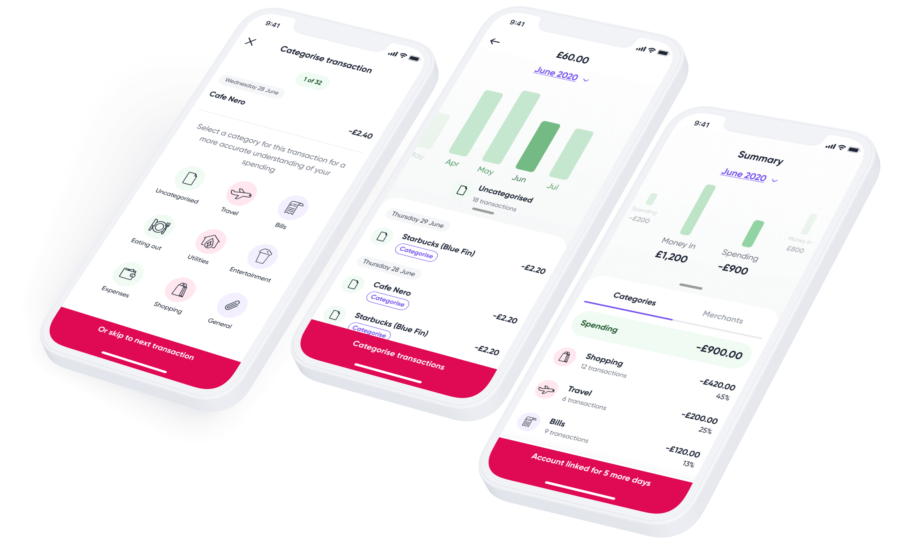
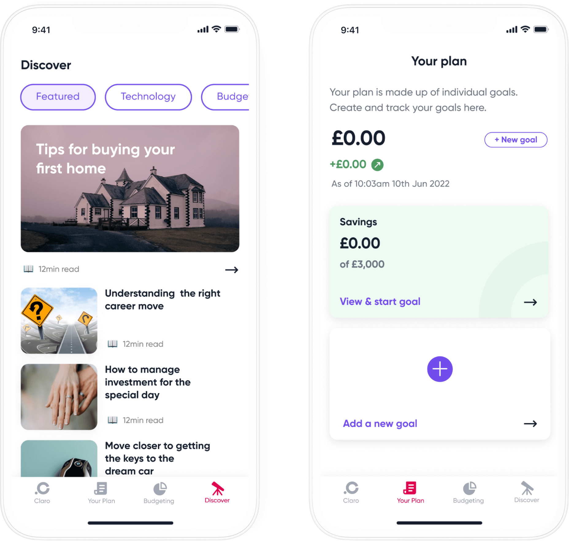
Introducing Spending
Connect your bank accounts via Open Banking to get a clear view of your spending.
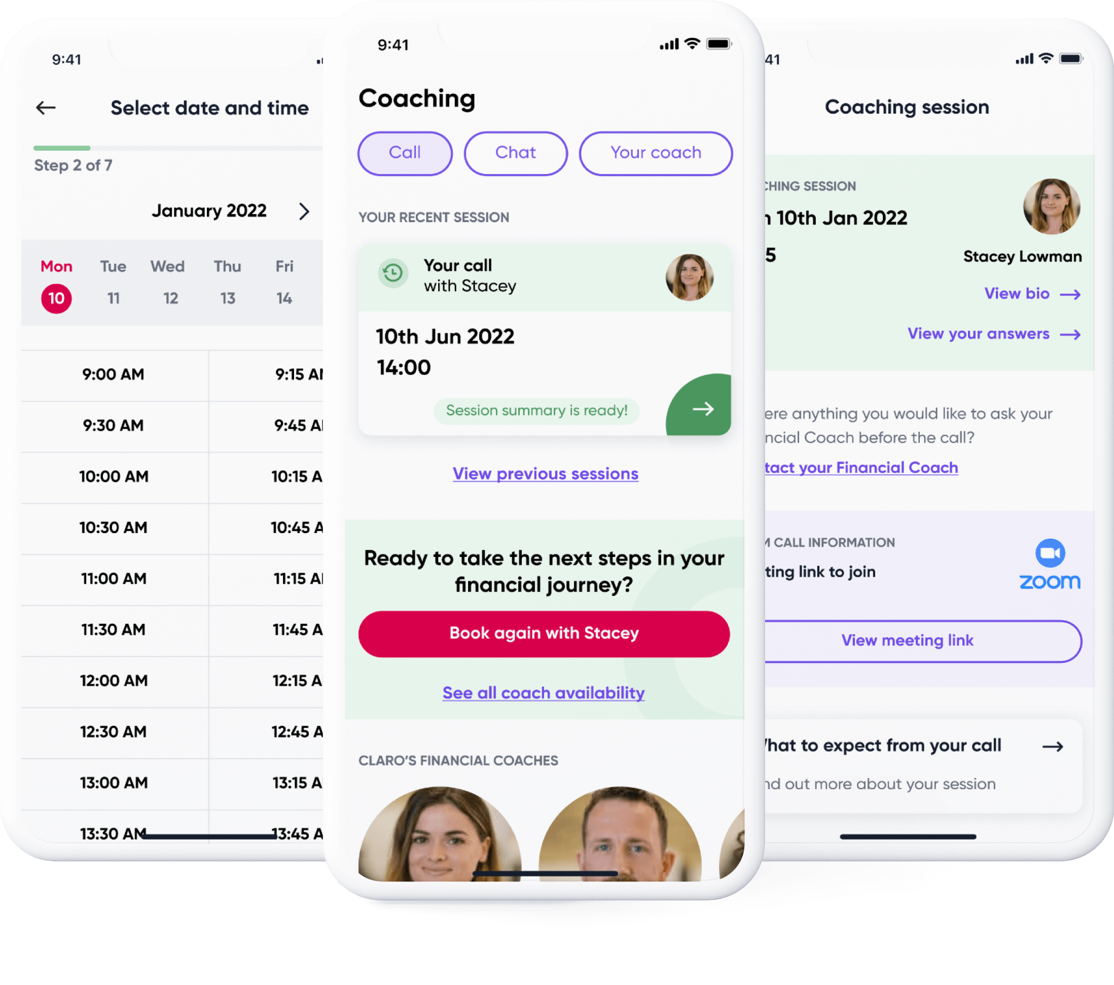
Coaching
Book a 1:1 session with an expert Financial Coach to discuss your goals and plan for the future.
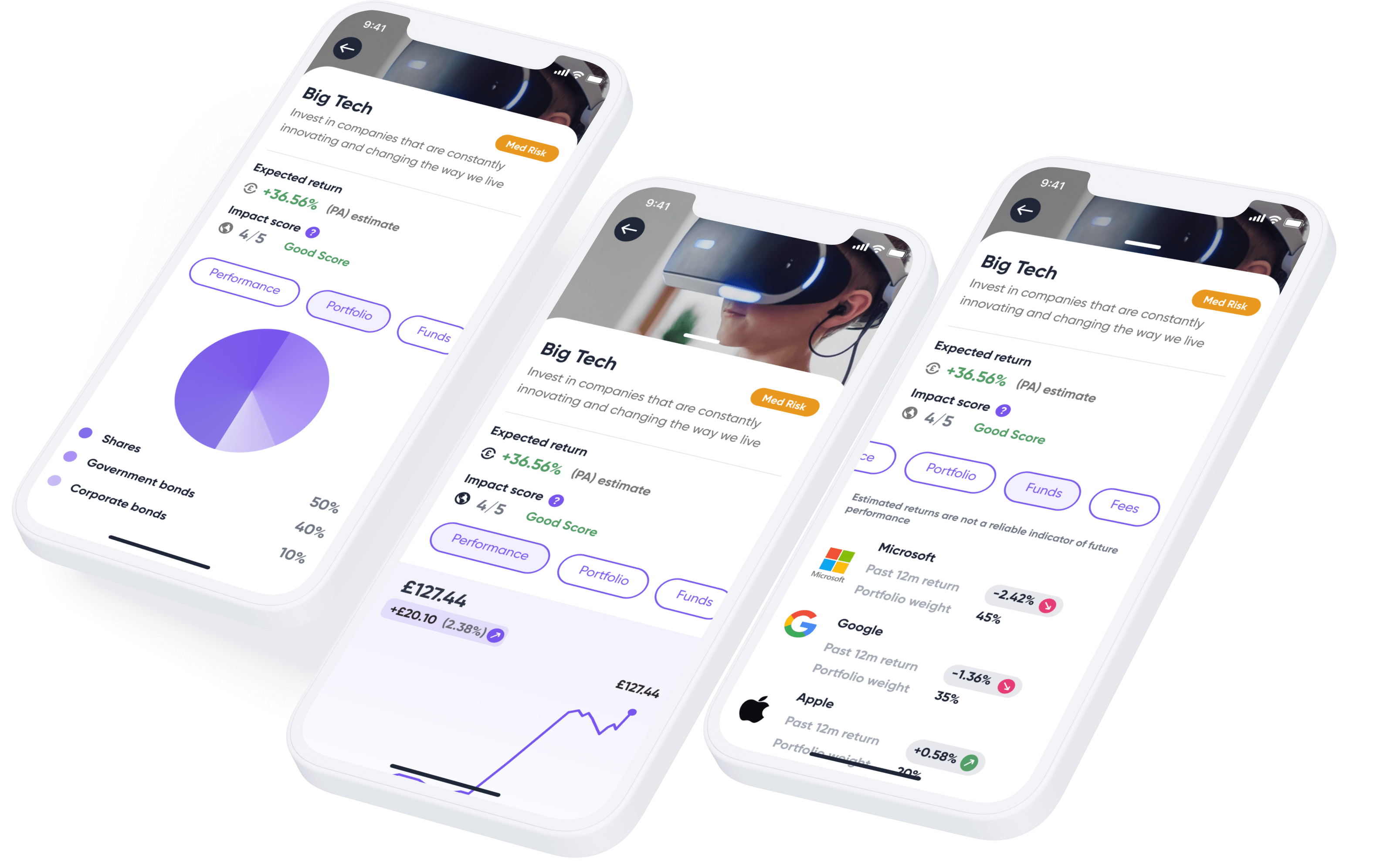
Investing
Ability to choose from a range of financial investments and other products based on your goals and values.
Planning
Learn about finance with free content. Exclusive tips and guides to help you reach your goals. Read guides to buying your first home, budgeting and many more
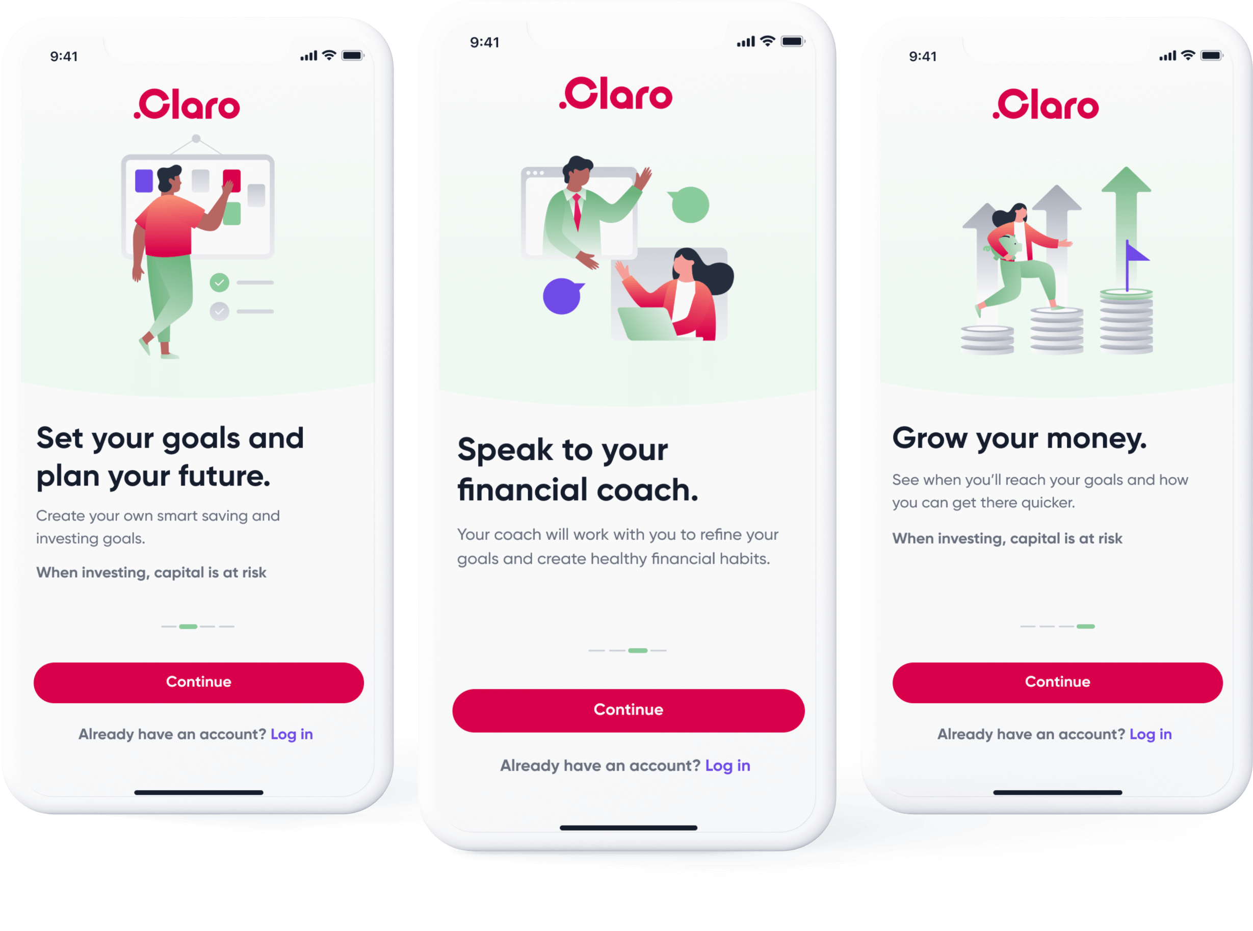
Splash Introduction
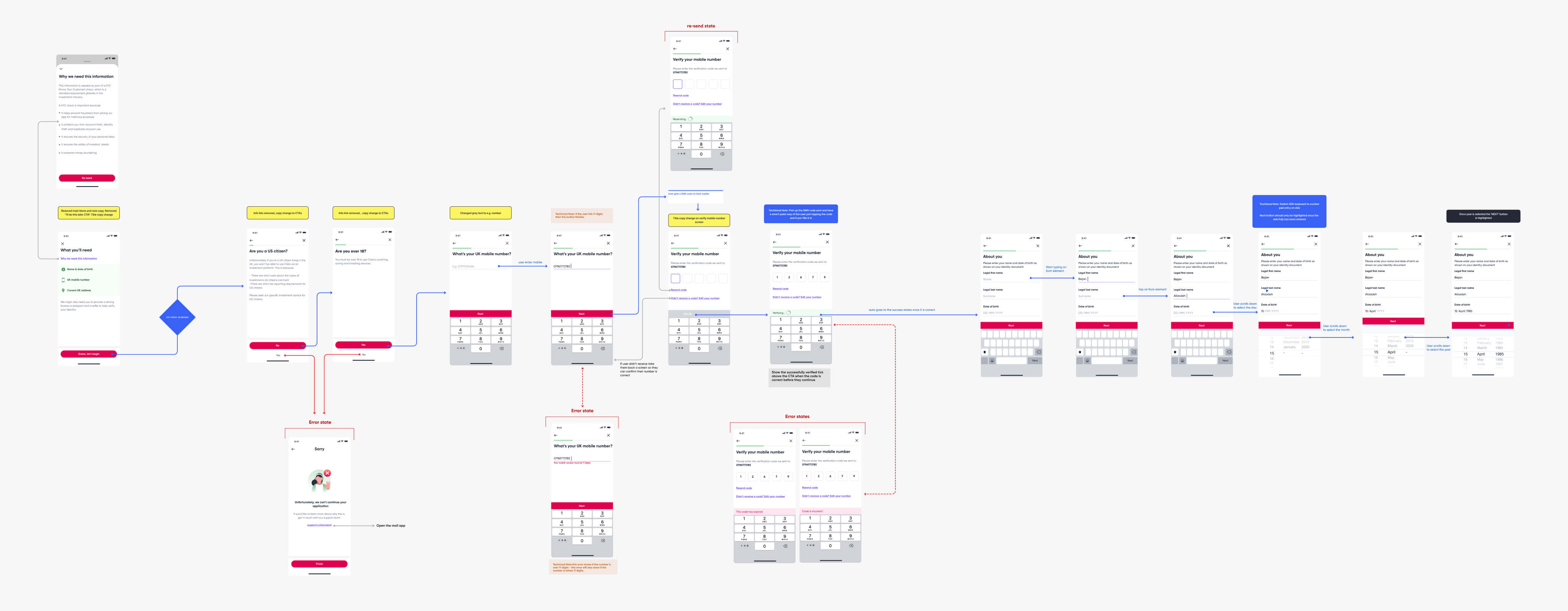
Screenflows - KYC
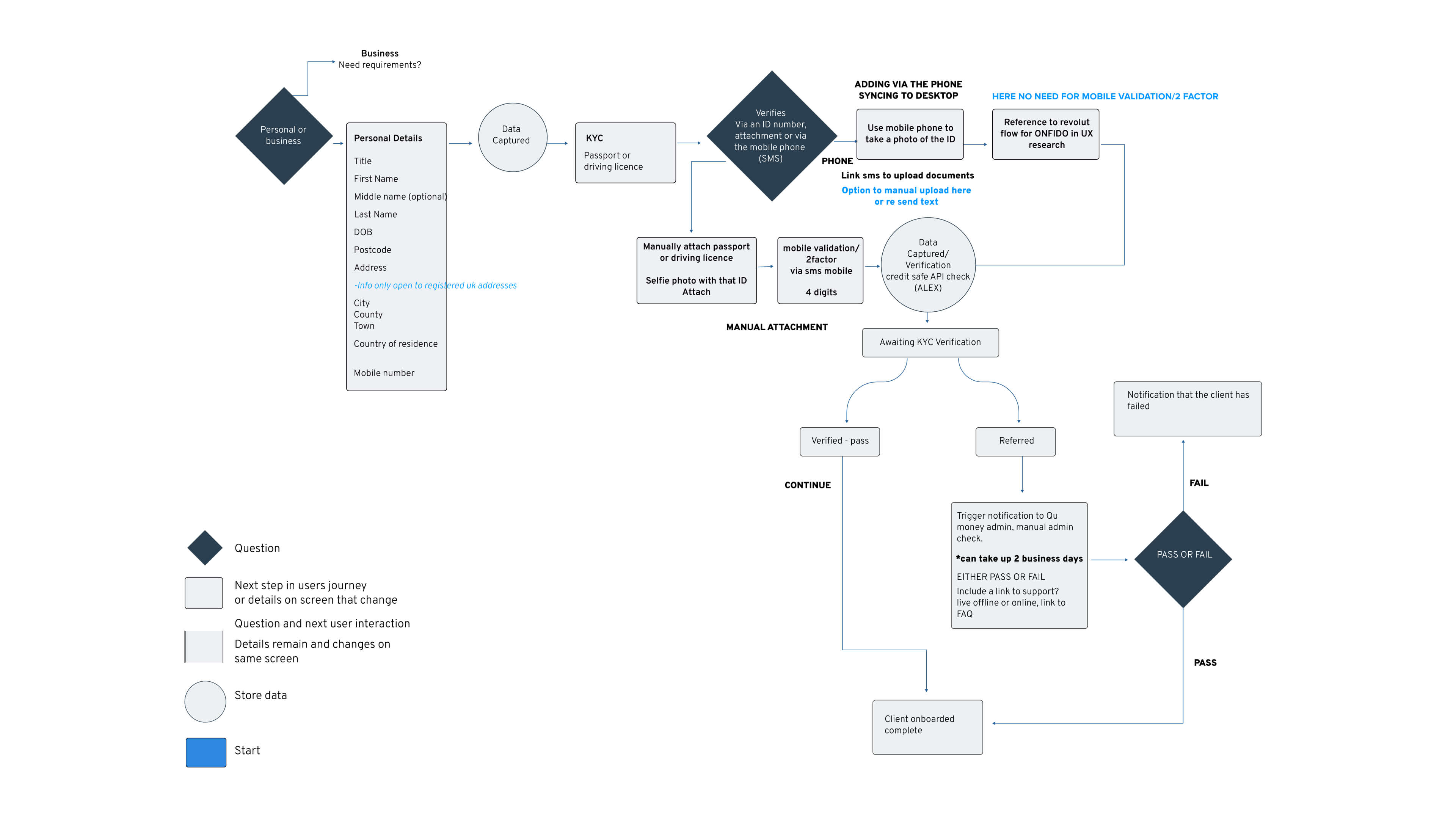
Below is a visual screen flow example of the KYC Verification process. This involved understanding different vendor business requirements, content & possible hurdles in the journey. The screen flow was tested beforehand to make sure most of the key hurdles have been taken into account to avoid user drop-off.
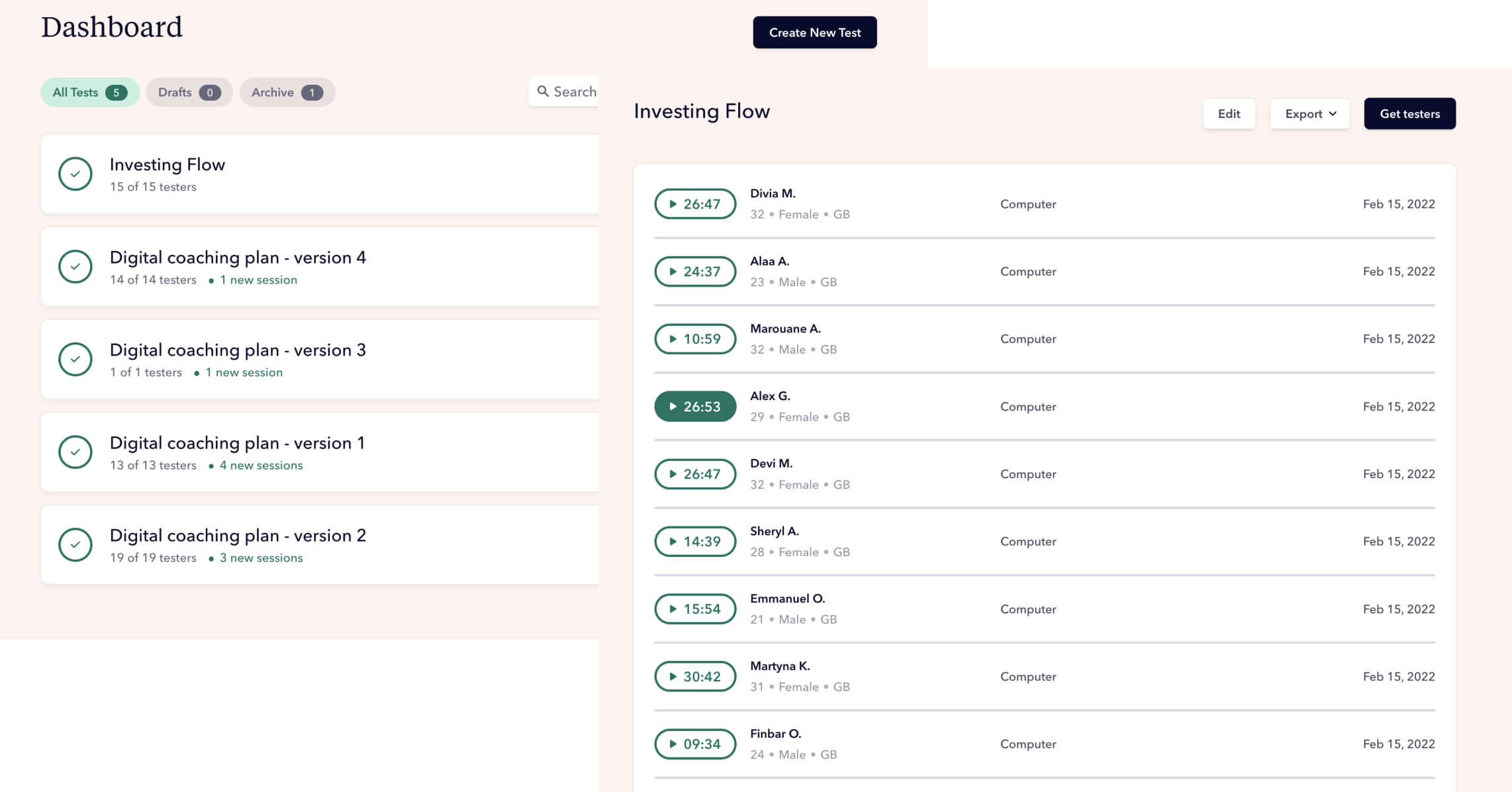
User Testing & Analytics
The flows were tested using Userbrain via Figma Prototypes mostly un-moderated testing but also 4-5 moderated tests were done via usertesting.com. Once the tests were in I'd manually view each test and add the feedback into an excel sheet. We would see patterns in the tests which highlight pain points and highlights in the journeys so that they can be refined accordingly.
Outcome
The product was built and released on the app store as an initial MVP, within 3 months we had over 40,000+ users. £2-3 million was invested into the product from users as investments into some of Claros's ESG funds. There included thousands of 1 to 1 free coaching calls on the product with new investors. The plan was to release a staged subscription plan with features such as booking a financial coaching call, access to more products & low fee plans
Learnings
Get the MVP out asap with simplified features do staggered improvements on the product, and Involve stakeholders at an early point. Create a subscription offering asap ideally after the initial registration stage. With open banking, trust is essential so having the reviews and trust elements visible without users having to search for them.
GOAL
The goal is to empower users to develop a smart money mindset to reach goals, and support them with a ‘do-it-with-me’ approach, also giving savers and investors the chance to support companies they care about who are making a positive impact on the world.
PROBLEM
Investing is complicated to get involved with especially when users don't understand the jargon, how investing works & what to invest in. Claro's idea was to understand users' goals, spending habits & interests via a one-to-one call with a financial coach & offer in-app investing solutions.
Research
Customer Interviews Persona
Market Analysis Quantitative Surveys
User Journeys Competitive Analysis
PROCESS
The research process was condensed to include a detailed competitive analysis which involved analysing app store/trust pilot reviews of top trending apps, understanding how the screen flows were structured. Below is the research structure involving qualitative & quantitive research. I'd done user interviews, created surveys & synthesis of findings.
PERSONAS
From the data of user interviews and surveys, I formed sets of user personas that was to be used to relate back to while designing the solution to make sure I'm designing for actual users and their needs.
EVALUATING AND SYNTHESIZING
Visualising the journey of a user from data gathered via research helped to see the opportunities, pain points & needs users would experience in the process.
Understanding The Coaching Process
A huge part was to understand the process of booking a coaching call which meant syncing with the financial coaches to understand their process & what information they would require to give an accurate summary for a user.
High Level Sketches
Rough visualisation of how to present the flows/screens before I began wireframes.
Mapping It Out
Created multiple flow diagrams for each screen flow to understand how to structure of the app. Examples of some of the flows were: onboarding, KYC, coaching, planning & spending. These flows were particularly useful for the development team to analyse before creating the visual/wireframe screen flows as they would be able to pinpoint any tech hurdles in the journey beforehand.
Wireframing
I began wireframing the individual screen flow journeys, the whole process was very collaborative with the rest of the team to make sure we are all aligned. This allowed me to test the process before hand to understand with users
Foundations and Style Guide
Claro commissioned an external agency to create a brand book for their brand & from that, I had to create a usable UI visual design library for Claro's app.
Elements were built using an 8 pt grid system concerning the 'Atomic design system method'
Design System
With reference to the style guide above I built out sets of reusable components that were used in all the screen flow documents for the product, this was especially useful for keeping all the elements of the product consistent. The library took into account accessibility, buttons, forms, widgets, list items, nav bars, cards, illustrations & tabs.
Introducing Spending
Connect your bank accounts via Open Banking to get a clear view of your spending.
Coaching
Book a 1:1 session with an expert Financial Coach to discuss your goals and plan for the future.
Investing
Ability to choose from a range of financial investments and other products based on your goals and values.
Planning
Learn about finance with free content. Exclusive tips and guides to help you reach your goals. Read guides to buying your first home, budgeting and many more
Splash Introduction
Screenflows - KYC
Below is a visual screen flow example of the KYC Verification process. This involved understanding different vendor business requirements, content & possible hurdles in the journey. The screen flow was tested beforehand to make sure most of the key hurdles have been taken into account to avoid user drop-off
User Testing & Analytics
The flows were tested using Userbrain via Figma Prototypes mostly un-moderated testing but also 4-5 moderated tests were done via usertesting.com. Once the tests were in I'd manually view each test and add the feedback into an excel sheet. We would see patterns in the tests which highlight pain points and highlights in the journeys so that they can be refined accordingly
Outcome
The product was built and released on the app store as an initial MVP, within 3 months we had over 40,000+ users. £2-3 million was invested into the product from users as investments into some of Claros's ESG funds. There included thousands of 1 to 1 free coaching calls on the product with new investors. We had over 300+ app store reviews averaging over 4.5 stars.
Learnings
Get the MVP out asap with simplified features do staggered improvements on the product, and Involve stakeholders at an early point. Create a subscription offering asap ideally after the initial registration stage. With open banking, trust is essential so having the reviews and trust elements visible without users having to search for them.
Strive to build successful digital products through evidence — based design
Don’t be a stranger, contact me below anytime. I'm always interested to hear about new projects.
© BEJANPAUL 2022
© BEJANPAUL 2022